
Ecommerce Product Page Checklist: What Actually Helps Conversion
The product imagery, copy, pricing, trust signals and mobile details that help buyers make a confident purchase decision.
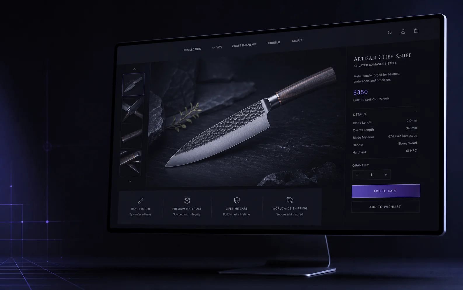
Attention → confidence → checkoutFIG.01
Short answer
A product page converts when it answers the buyer's remaining questions at the moment of decision. That means images that show scale and detail, a price with delivery and returns stated plainly, specifications a buyer can scan, honest trust signals, and a mobile purchase path tested on a real phone.
Key takeaways
- Most lost sales are unanswered questions, not pricing objections.
- Show scale, texture and what is in the box — not just a catalogue shot on white.
- Delivery cost, timeline and returns belong near the buy button, not on a separate page.
- Test the purchase path on a real phone on mobile data before blaming traffic quality.
A product page has one job: remove enough uncertainty for the right customer to buy. More badges and popups do not automatically improve conversion. A strong ecommerce storefront makes the product easy to understand, compare and trust on a phone.
Show the product properly
- A clean primary image that explains shape, finish and scale immediately.
- Useful angles, detail shots and an in-context image where size matters.
- Consistent crops and color treatment across the catalogue.
- Compressed WebP or AVIF assets that stay sharp without delaying the page.
Answer buying questions near the decision
Put price, variants, stock state, delivery expectation, returns and the primary action together. Specifications and care details belong close enough to help without pushing the purchase controls below several screens of marketing copy.
Use trust signals honestly
Verified reviews, clear guarantees, secure payment options and accurate delivery information work because they reduce risk. Fake scarcity, permanent countdowns and unsupported claims train customers not to trust the store.
Test the mobile purchase path
Check variant selection, sticky actions, image gestures, keyboard behavior and payment recovery on real devices. The Kronos Knives case study demonstrates a product-led premium storefront direction. For a catalogue review, share your store.
Frequently asked questions
How many product images are enough?
Use enough images to answer material, scale and usage questions. Most products need four to eight purposeful images rather than a fixed universal number.
Should product pages use video?
Use short video when motion, fit, texture or assembly is difficult to explain in still images. Optimize it carefully so it does not block the page.
What should be above the fold on mobile?
Product identity, primary image, price, important variant controls and a clear purchase action should be available with minimal scrolling.
/Services in this article
/UI/UX Design by country
/Related project previews
See the ideas in production


Keep reading
All articlesWhat a Global Ecommerce Operations Website Must Explain
How to turn sourcing, marketplace management, warehousing, fulfillment and reporting into a clear website that earns consultation requests.

Web Design in Pakistan: What Changes Between Karachi, Lahore and Islamabad
How a business website should differ depending on whether its customers are in Karachi, Lahore or Islamabad — what visitors in each city expect, what they search for, how they pay and contact you — and how to brief a web designer in any of them.